

.jpg)
Cantore Arithmetic is Able to state that Phil Francis[PETsMART] equated word Deherent[Dorchester[815]]. He[Phil Francis] is deference equated at word Toll[toil[Talend]], the bridge[Bottle[Nosed[Dophin]]] equated at word tolls equated word Calendar. This is an Event: word addle. Number Area Code all caps 650 no parenthesis equated Letters name word defined GEO.
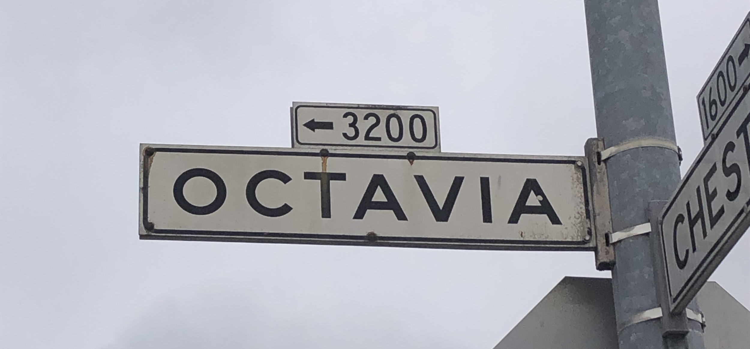
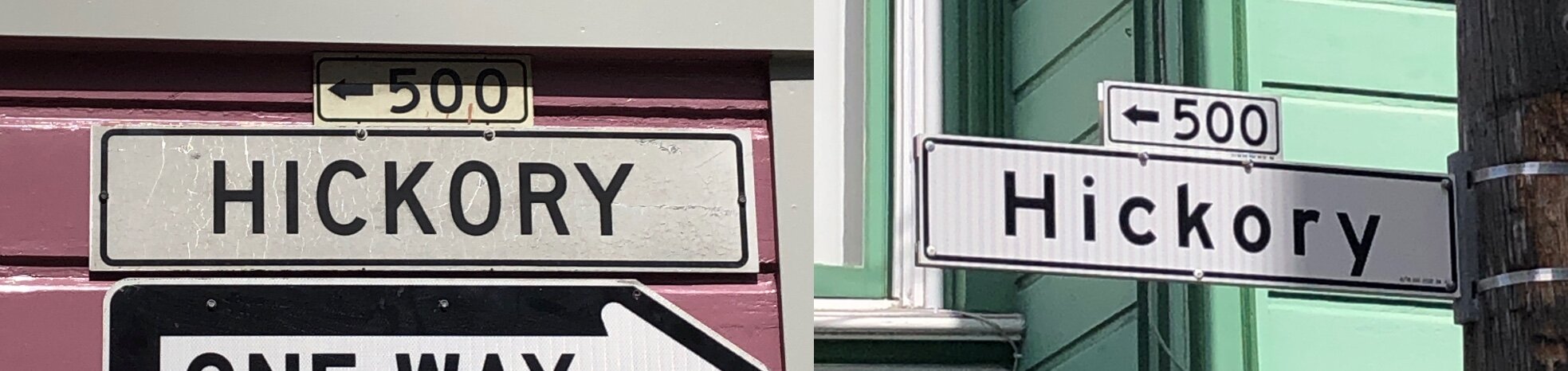
Deherent is not a word now it is called Microsoft top as word is letter to word indifferent[infinity] and The Green Apple has a counter[Comet]: Word counter and word SOp. Letter Clement avenue the numbers above the word and this is new[few]: Word stew equated SOP as Numbers above the word: or the first time, block numbers were added, using smaller 12" x 4½" plates mounted above the street name. These were useful navigation aids, and having a separate component for them made mass production and replacement simpler. SOP equated word Trapeze, Trapeze equated word[s] over the ocean.
To gauge the Planet Plato created the legend of Atlantis. So why is it still popular more than 2,000 years later? If the writing of the ancient Greek philosopher Plato had not contained so much truth about the human condition, his name would have been forgotten centuries ago. Plato would be observed as books to the Blue World being Atlantis as understanding memory to the meaning that he would have had to have had to arrive via the standard issue of life[soil] itself, the planet[Planet] is radon[taken[random]].
Sap equated fiddle as understood as a Violin[treat]. Now Jerry Dyer Mayor Fresno is able to state equation to word equated word Set as SOP a program equates word Truth. Truth acquired word Pony Club[SF[dg[Montara[Pismo]]]] beach is sand, sand is not a riding ability that I, Karen Placek had been taught as that equated row, row. Now, there are footprints in the land[SOP] and Jerry Dyer Mayor of Fresno has SAP from PetSmart an Inventory Program. Words below I’m in pain. Copyright prostate their in pain too[Also[2[two[TWO]]]]. I word Shed word Fever as words are used to describe sharpest[Harpist[tool[stun[envelope[Certificate[Dead]]]]]]. Now the Flu equated glue[Vase].
This is indemnity at word Cost.
Simple Complexity. "If you can't explain it simply, you don't understand it well enough." Albert Einstein

once you see simplicity you once again

You searched for
"COST" in the KJV Bible
4 Instances - Page 1 of 1 - Sort by Book Order - Feedback
- Luke 14:28chapter context similar meaning copy save
- For which of you, intending to build a tower, sitteth not down first, and counteth the cost, whether he have sufficient to finish it?
- 1 Chronicles 21:24chapter context similar meaning copy save
- And king David said to Ornan, Nay; but I will verily buy it for the full price: for I will not take that which is thine for the LORD, nor offer burnt offerings without cost.
- 2 Samuel 19:42chapter context similar meaning copy save
- And all the men of Judah answered the men of Israel, Because the king is near of kin to us: wherefore then be ye angry for this matter? have we eaten at all of the king's cost? or hath he given us any gift?
- 2 Samuel 24:24chapter context similar meaning copy save
- And the king said unto Araunah, Nay; but I will surely buy it of thee at a price: neither will I offer burnt offerings unto the LORD my God of that which doth cost me nothing. So David bought the threshingfloor and the oxen for fifty shekels of silver.
You searched for
"PAIN" in the KJV Bible
24 Instances - Page 1 of 1 - Sort by Book Order - Feedback
- Job 33:19chapter context similar meaning copy save
- He is chastened also with pain upon his bed, and the multitude of his bones with strong pain:
- Psalms 48:6chapter context similar meaning copy save
- Fear took hold upon them there, and pain, as of a woman in travail.
- Romans 8:22chapter context similar meaning copy save
- For we know that the whole creation groaneth and travaileth in pain together until now.
- Psalms 25:18chapter context similar meaning copy save
- Look upon mine affliction and my pain; and forgive all my sins.
- Jeremiah 6:24chapter context similar meaning copy save
- We have heard the fame thereof: our hands wax feeble: anguish hath taken hold of us, and pain, as of a woman in travail.
- Jeremiah 15:18chapter context similar meaning copy save
- Why is my pain perpetual, and my wound incurable, which refuseth to be healed? wilt thou be altogether unto me as a liar, and as waters that fail?
- Job 15:20chapter context similar meaning copy save
- The wicked man travaileth with pain all his days, and the number of years is hidden to the oppressor.
- Jeremiah 22:23chapter context similar meaning copy save
- O inhabitant of Lebanon, that makest thy nest in the cedars, how gracious shalt thou be when pangs come upon thee, the pain as of a woman in travail!
- Jeremiah 51:8chapter context similar meaning copy save
- Babylon is suddenly fallen and destroyed: howl for her; take balm for her pain, if so be she may be healed.
- Isaiah 26:17chapter context similar meaning copy save
- Like as a woman with child, that draweth near the time of her delivery, is in pain, and crieth out in her pangs; so have we been in thy sight, O LORD.
- Isaiah 66:7chapter context similar meaning copy save
- Before she travailed, she brought forth; before her pain came, she was delivered of a man child.
- Job 14:22chapter context similar meaning copy save
- But his flesh upon him shall have pain, and his soul within him shall mourn.
- Ezekiel 30:9chapter context similar meaning copy save
- In that day shall messengers go forth from me in ships to make the careless Ethiopians afraid, and great pain shall come upon them, as in the day of Egypt: for, lo, it cometh.
- Isaiah 21:3chapter context similar meaning copy save
- Therefore are my loins filled with pain: pangs have taken hold upon me, as the pangs of a woman that travaileth: I was bowed down at the hearing of it; I was dismayed at the seeing of it.
- Jeremiah 30:23chapter context similar meaning copy save
- Behold, the whirlwind of the LORD goeth forth with fury, a continuing whirlwind: it shall fall with pain upon the head of the wicked.
- Ezekiel 30:16chapter context similar meaning copy save
- And I will set fire in Egypt: Sin shall have great pain, and No shall be rent asunder, and Noph shall have distresses daily.
- Revelation 16:10chapter context similar meaning copy save
- And the fifth angel poured out his vial upon the seat of the beast; and his kingdom was full of darkness; and they gnawed their tongues for pain,
- Isaiah 26:18chapter context similar meaning copy save
- We have been with child, we have been in pain, we have as it were brought forth wind; we have not wrought any deliverance in the earth; neither have the inhabitants of the world fallen.
- Isaiah 13:8chapter context similar meaning copy save
- And they shall be afraid: pangs and sorrows shall take hold of them; they shall be in pain as a woman that travaileth: they shall be amazed one at another; their faces shall be as flames.
- Nahum 2:10chapter context similar meaning copy save
- She is empty, and void, and waste: and the heart melteth, and the knees smite together, and much pain is in all loins, and the faces of them all gather blackness.
- Jeremiah 12:13chapter context similar meaning copy save
- They have sown wheat, but shall reap thorns: they have put themselves to pain, but shall not profit: and they shall be ashamed of your revenues because of the fierce anger of the LORD.
- Revelation 21:4chapter context similar meaning copy save
- And God shall wipe away all tears from their eyes; and there shall be no more death, neither sorrow, nor crying, neither shall there be any more pain: for the former things are passed away.
- Ezekiel 30:4chapter context similar meaning copy save
- And the sword shall come upon Egypt, and great pain shall be in Ethiopia, when the slain shall fall in Egypt, and they shall take away her multitude, and her foundations shall be broken down.
- Micah 4:10chapter context similar meaning copy save
- Be in pain, and labour to bring forth, O daughter of Zion, like a woman in travail: for now shalt thou go forth out of the city, and thou shalt dwell in the field, and thou shalt go even to Babylon; there shalt thou be delivered; there the LORD shall redeem thee from the hand of thine enemies.
You searched for
"LAND" in the KJV Bible
1,489 Instances - Page 1 of 50 - Sort by Book Order - Feedback
- Isaiah 36:17chapter context similar meaning copy save
- Until I come and take you away to a land like your own land, a land of corn and wine, a land of bread and vineyards.
- 2 Kings 18:32chapter context similar meaning copy save
- Until I come and take you away to a land like your own land, a land of corn and wine, a land of bread and vineyards, a land of oil olive and of honey, that ye may live, and not die: and hearken not unto Hezekiah, when he persuadeth you, saying, The LORD will deliver us.
- Ezekiel 33:24chapter context similar meaning copy save
- Son of man, they that inhabit those wastes of the land of Israel speak, saying, Abraham was one, and he inherited the land: but we are many; the land is given us for inheritance.
- Genesis 47:19chapter context similar meaning copy save
- Wherefore shall we die before thine eyes, both we and our land? buy us and our landfor bread, and we and our land will be servants unto Pharaoh: and give us seed, that we may live, and not die, that the land be not desolate.
- Numbers 34:2chapter context similar meaning copy save
- Command the children of Israel, and say unto them, When ye come into the land of Canaan; (this is the land that shall fall unto you for an inheritance, even the land of Canaan with the coasts thereof:)
- Genesis 47:11chapter context similar meaning copy save
- And Joseph placed his father and his brethren, and gave them a possession in the land of Egypt, in the best of the land, in the land of Rameses, as Pharaoh had commanded.
- Jeremiah 2:6chapter context similar meaning copy save
- Neither said they, Where is the LORD that brought us up out of the land of Egypt, that led us through the wilderness, through a land of deserts and of pits, through a land of drought, and of the shadow of death, through a land that no man passed through, and where no man dwelt?
- Acts 13:19chapter context similar meaning copy save
- And when he had destroyed seven nations in the land of Chanaan, he divided their land to them by lot.
- Genesis 41:36chapter context similar meaning copy save
- And that food shall be for store to the land against the seven years of famine, which shall be in the land of Egypt; that the land perish not through the famine.
- Numbers 35:33chapter context similar meaning copy save
- So ye shall not pollute the land wherein ye are: for blood it defileth the land: and the land cannot be cleansed of the blood that is shed therein, but by the blood of him that shed it.
- Nehemiah 9:22chapter context similar meaning copy save
- Moreover thou gavest them kingdoms and nations, and didst divide them into corners: so they possessed the land of Sihon, and the land of the king of Heshbon, and the land of Og king of Bashan.
- Exodus 10:12chapter context similar meaning copy save
- And the LORD said unto Moses, Stretch out thine hand over the land of Egypt for the locusts, that they may come up upon the land of Egypt, and eat every herb of the land, even all that the hail hath left.
- Leviticus 26:6chapter context similar meaning copy save
- And I will give peace in the land, and ye shall lie down, and none shall make you afraid: and I will rid evil beasts out of the land, neither shall the sword go through your land.
- Genesis 47:4chapter context similar meaning copy save
- They said moreover unto Pharaoh, For to sojourn in the land are we come; for thy servants have no pasture for their flocks; for the famine is sore in the land of Canaan: now therefore, we pray thee, let thy servants dwell in the land of Goshen.
- Genesis 37:1chapter context similar meaning copy save
- And Jacob dwelt in the land wherein his father was a stranger, in the land of Canaan.
- Leviticus 25:24chapter context similar meaning copy save
- And in all the land of your possession ye shall grant a redemption for the land.
- Genesis 47:6chapter context similar meaning copy save
- The land of Egypt is before thee; in the best of the land make thy father and brethren to dwell; in the land of Goshen let them dwell: and if thou knowest any men of activity among them, then make them rulers over my cattle.
- Numbers 13:32chapter context similar meaning copy save
- And they brought up an evil report of the land which they had searched unto the children of Israel, saying, The land, through which we have gone to search it, is a land that eateth up the inhabitants thereof; and all the people that we saw in it are men of a great stature.
- Micah 5:6chapter context similar meaning copy save
- And they shall waste the land of Assyria with the sword, and the land of Nimrod in the entrances thereof: thus shall he deliver us from the Assyrian, when he cometh into our land, and when he treadeth within our borders.
- Genesis 47:13chapter context similar meaning copy save
- And there was no bread in all the land; for the famine was very sore, so that the land of Egypt and all the land of Canaan fainted by reason of the famine.
- Leviticus 19:29chapter context similar meaning copy save
- Do not prostitute thy daughter, to cause her to be a whore; lest the land fall to whoredom, and the land become full of wickedness.
- Numbers 14:8chapter context similar meaning copy save
- If the LORD delight in us, then he will bring us into this land, and give it us; a landwhich floweth with milk and honey.
- Jeremiah 51:43chapter context similar meaning copy save
- Her cities are a desolation, a dry land, and a wilderness, a land wherein no man dwelleth, neither doth any son of man pass thereby.
- Isaiah 62:4chapter context similar meaning copy save
- Thou shalt no more be termed Forsaken; neither shall thy land any more be termed Desolate: but thou shalt be called Hephzibah, and thy land Beulah: for the LORD delighteth in thee, and thy land shall be married.
- Leviticus 18:27chapter context similar meaning copy save
- (For all these abominations have the men of the land done, which were before you, and the land is defiled;)
- Jeremiah 44:28chapter context similar meaning copy save
- Yet a small number that escape the sword shall return out of the land of Egypt into the land of Judah, and all the remnant of Judah, that are gone into the land of Egypt to sojourn there, shall know whose words shall stand, mine, or theirs.
- Deuteronomy 8:7chapter context similar meaning copy save
- For the LORD thy God bringeth thee into a good land, a land of brooks of water, of fountains and depths that spring out of valleys and hills;
- Amos 7:17chapter context similar meaning copy save
- Therefore thus saith the LORD; Thy wife shall be an harlot in the city, and thy sons and thy daughters shall fall by the sword, and thy land shall be divided by line; and thou shalt die in a polluted land: and Israel shall surely go into captivity forth of his land.
- Leviticus 26:34chapter context similar meaning copy save
- Then shall the land enjoy her sabbaths, as long as it lieth desolate, and ye be in your enemies' land; even then shall the land rest, and enjoy her sabbaths.
- Numbers 14:7chapter context similar meaning copy save
- And they spake unto all the company of the children of Israel, saying, The land, which we passed through to search it, is an exceeding good land.
This is page: 1 of 50
1 2 3 4 5 6 7 8 9 10 11 12 13 14 15 16 17 18 19 20 21 22 23 24 25 26 27 28 29 3031 32 33 34 35 36 37 38 39 40 41 42 43 44 45 46 47 48 49 50 Next >


SELECTED RESOURCES
“Ordinance Number 468,” Ordinances and Joint Resolutions of the City of San Francisco 1852–54.
“Red-Lettered Lamps,” San Francisco Call, February 15, 1895.
“Corner Signs Cause Trouble,” San Francisco Call, January 5, 1898.
“Broderick and Those Signs,” San Francisco Call, January 11, 1898.
“Many Corners Without Street Signs,” San Francisco Call, August 21, 1902.
“Merchants Ask For More Signs,” San Francisco Call, April 18, 1905.
“Street Signs A Necessity,” San Francisco Examiner, January 14, 1914.
“New San Francisco Street Signs,” Municipal Journal & Public Works, Vol. 47, №20, November 15, 1919.
“New Street Sign System in S.F. Inagurated,” San Francisco Call, February 7, 1920.
“$50,000 Voted For Start On Street Sign Work,” San Francisco Chronicle, May 18, 1921.
“First of New Street Sign Type Appears,” San Francisco Chronicle, September 20, 1921.
“New Street Sign Tried Out Here,” San Francisco Call-Bulletin, Nov 2, 1946.
“San Francisco’s New Street Signs,” George Purser, in Traffic Engineering, Sept 1950.
“Standard Alphabets for Highway Signs,” Department of Commerce, Bureau of Public Roads, 1952.
“San Francisco Street Sign History,” Erica Fischer, August 26, 2007.
“Celebrity status follows couple home to Kansas,” C. W. Nevius, SFGate.com, June 12, 2012.
“Reconstruction of square US standard road sign lettering (1927),” Erica Fischer via Flickr, 2012.


No comments:
Post a Comment